.png)
ROLE/SERVICES
UX Architecture & Product Design
LOCATION
Colombia / Panama
YEAR
2022
Summary
A two-sided B2B marketplace designed from scratch, with two very different user experiences that still needed to feel like one product.
APPURA
The Platform
The Architecture
UX architecture & information design Two-sided product design Design system (built and maintained) User research & competitive analysis Lo-fi to mid-fi to high-fi prototype
Scope
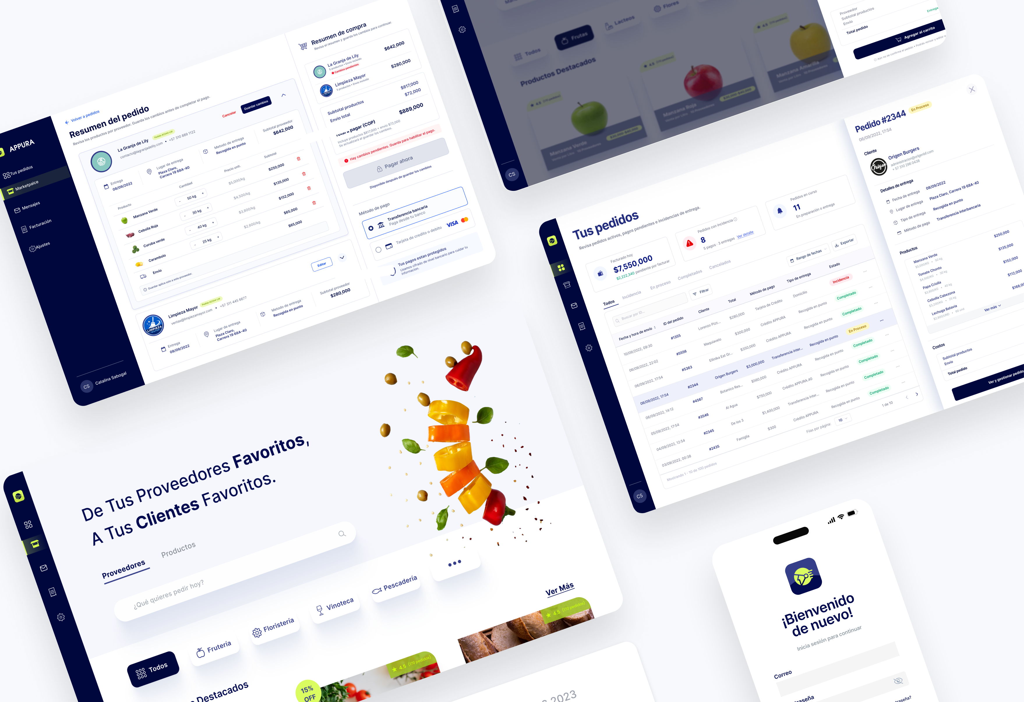
Appura is a B2B marketplace connecting businesses such as restaurants, hotels, catering operations, and retail chains with food, beverage, and supplies distributors. The main UX challenge was that buyers and suppliers needed fundamentally different experiences. Buyers needed discovery, comparison, and checkout. Suppliers needed order management and fulfilment. That meant the information architecture had to separate the two clearly before getting into screen-level design.
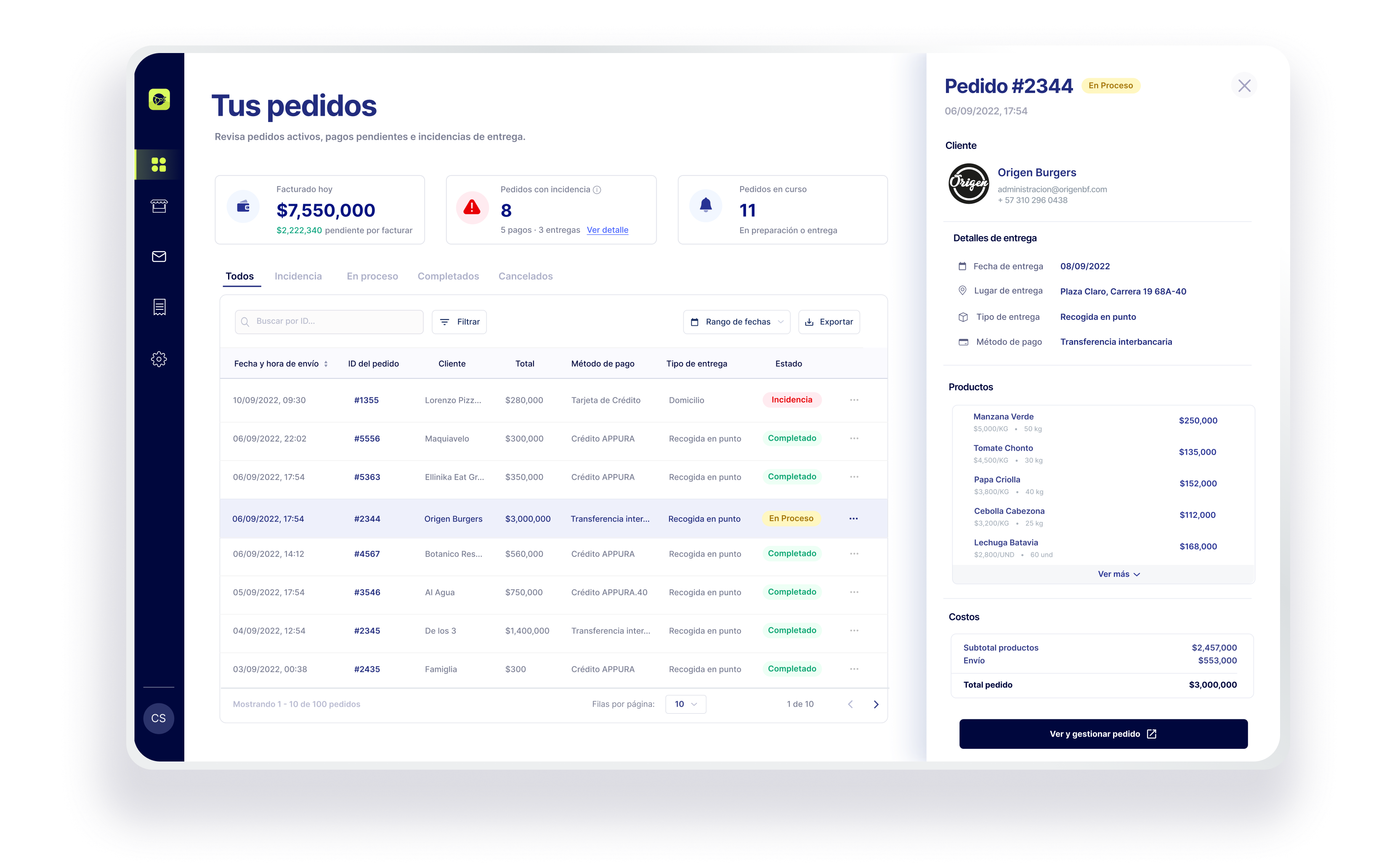
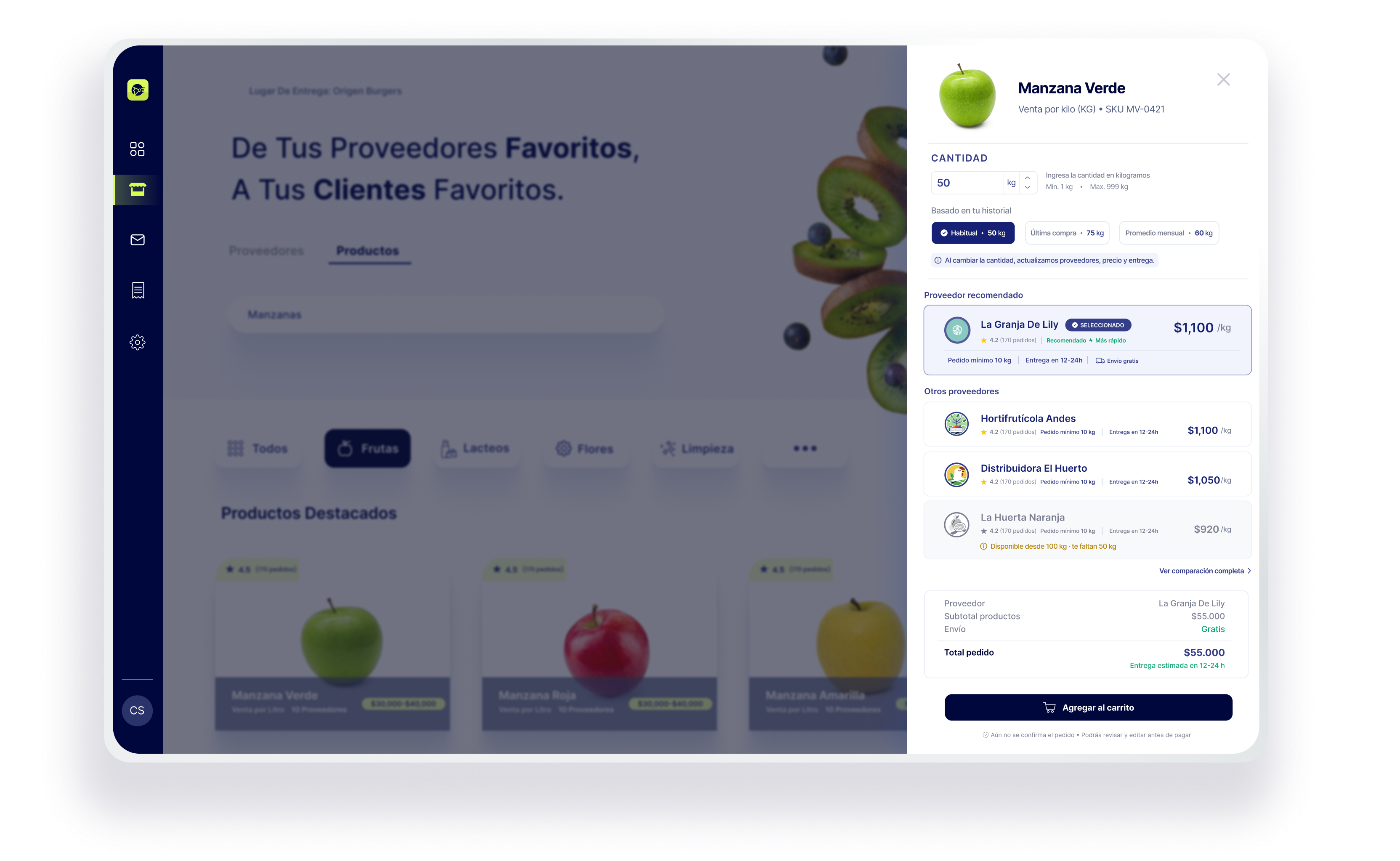
On the buyer side, I designed two parallel ways to navigate the same inventory: browse by Supplier or browse by Product. Product pages let buyers compare multiple suppliers for the same SKU and sort by delivery speed, price, or rating. The cart also handles minimum-order requirements progressively, showing exactly how much is left to reach the minimum instead of waiting until checkout to block the order. The supplier side was designed separately around operational needs: real-time notifications, a paginated order dashboard, payment tracking, and a revenue view split between received and pending payments.
Research
Competitive analysis of Choco, Katoo, and PhiloMarket helped confirm a few gaps in the market. None offered real-time comparison between suppliers at the product level, progressive guidance for minimum-order requirements inside the cart, or a fully integrated payment layer. I used MoSCoW prioritisation to define the first phase around supplier comparison, minimum-order enforcement, Google Maps delivery, and the Crédito APPURA payment instrument. Recurring delivery scheduling was left for phase two.
.png)